MoneyMate Case Study for UX design workshop
Objectives
For this case study, the objective was to transform a given concept into a polished design prototype. As part of a UX design course held by Kreativstorm, I was provided with a description of a financial app dashboard called MoneyMate, along with detailed screens and tasks within the app. My goal was to take these ideas and develop them into a fully realized, user-friendly interface that effectively communicates the app's functionality.
Process
Discovery
During the discovery phase, I conducted benchmarking to gather inspiration and understand current trends in the financial industry and fintech applications. This involved analyzing and testing various financial apps to identify best practices, common features, and design patterns. These insights helped shape the direction of the MoneyMate dashboard, ensuring the design would be relevant and user-friendly within the competitive fintech landscape.
Information Architecture
The Information Architecture illustrates the structure and organization of MoneyMate's content and features, also detailing the specific actions users can perform on each page. This mapping helped visualize how different features connect and interact, which ensures a seamless user flow. The IA provided a solid foundation for the wireframing and overall design process.
Wireframing
In the wireframing phase, I created simple, rough visualizations of the app to get a clear idea of its overall structure and layout. This helped me bring my ideas to life in a visible way, making it easier to think through how everything would work together. It was a useful step for exploring different options and planning the app's flow before moving on to more detailed design.
Color Palette
For the color palette, I chose green because it's often linked to wealth and also conveys a sense of harmony, which fits well with a financial management app. I added yellow to represent the color of gold coins, bringing a more optimistic vibe to the design.
UI Kit
After finalizing the colors and typography, I created a quick UI kit containing all the recurring elements needed for the prototype. The prototype was built on the polished wireframes, with adjustments to element positioning and container widths to better fit the mobile screen and enhance the overall color scheme.
Typography
For typography, I chose Arvo for headlines and the logo because of its decorative serif style, which adds character. Since serif fonts aren't always ideal for longer digital text, I paired Arvo with Geologica, a more structured and balanced font. Geologica is versatile and works well in different weights, making it a great choice for body text and supporting content throughout the app.
Prototyping
Final Visual Design
The final
Mockups
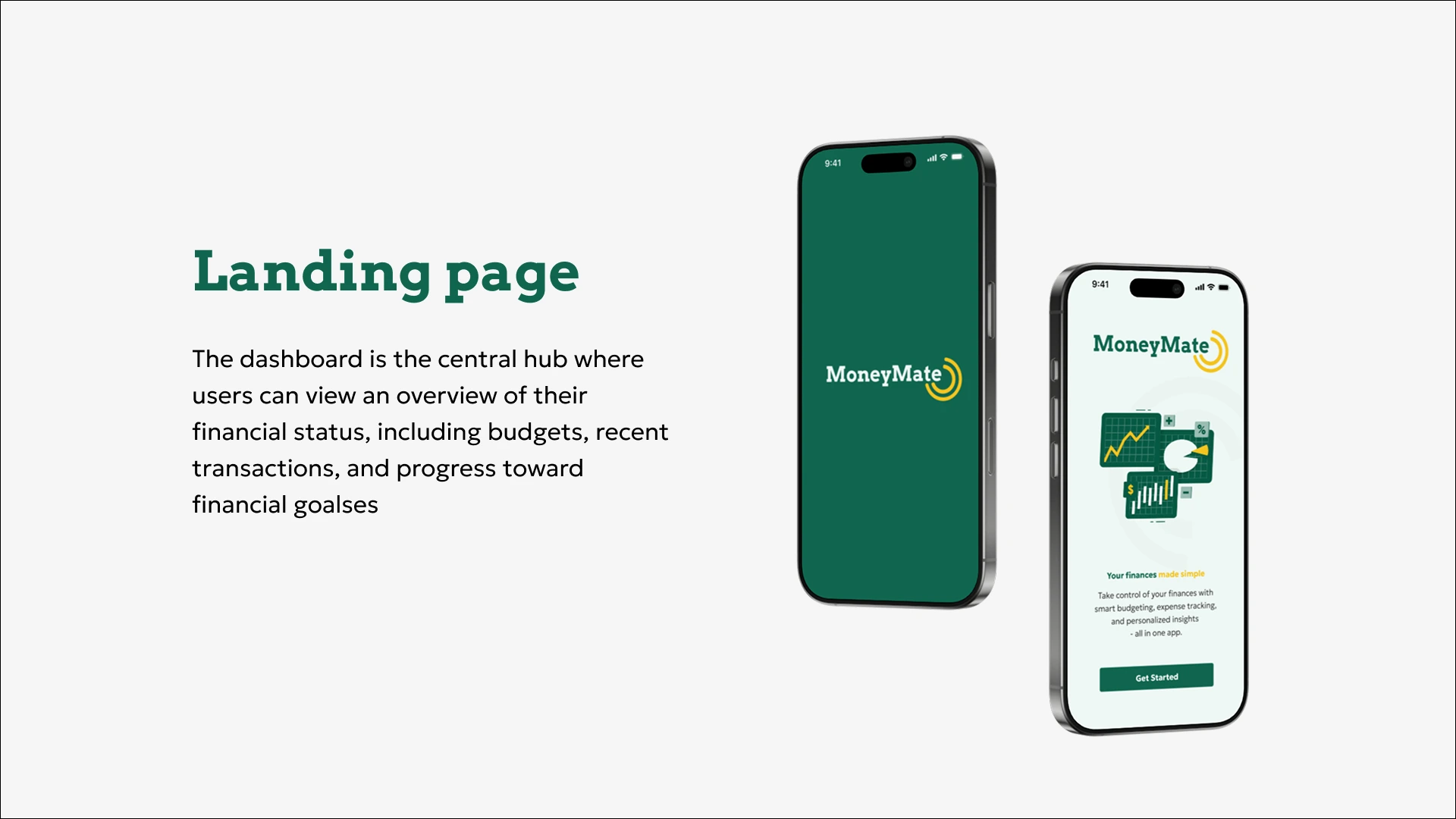
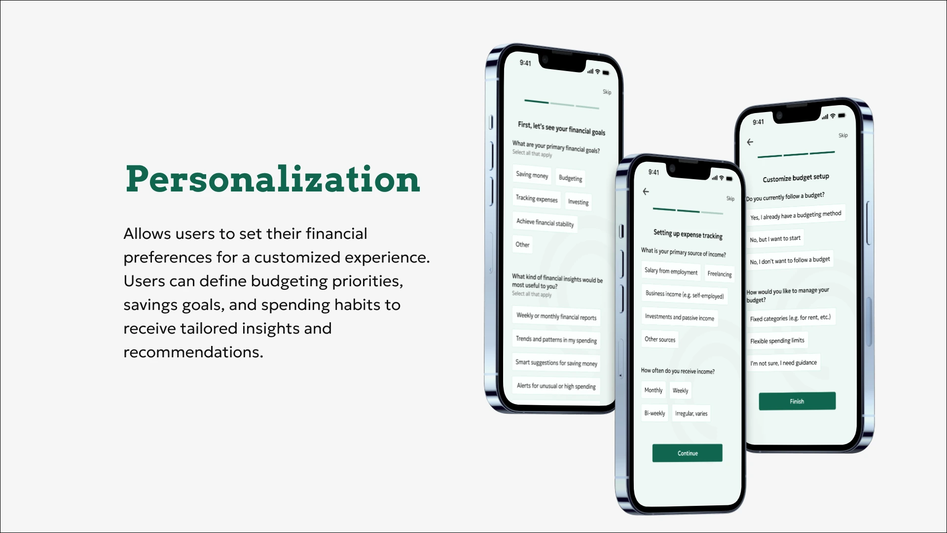
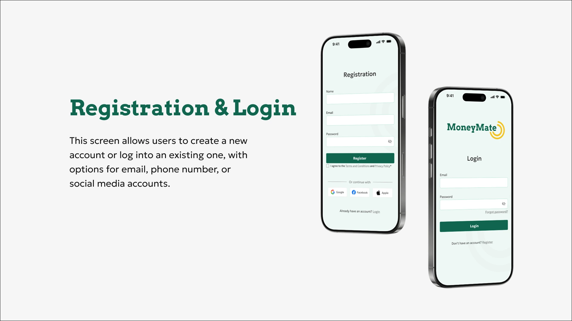
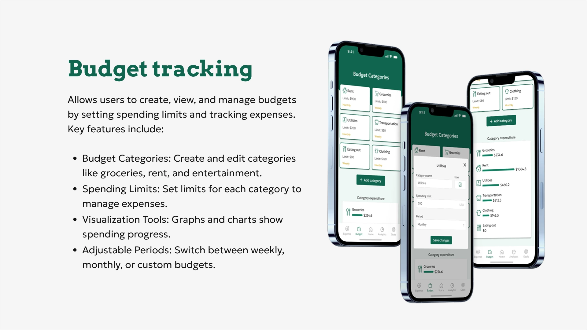
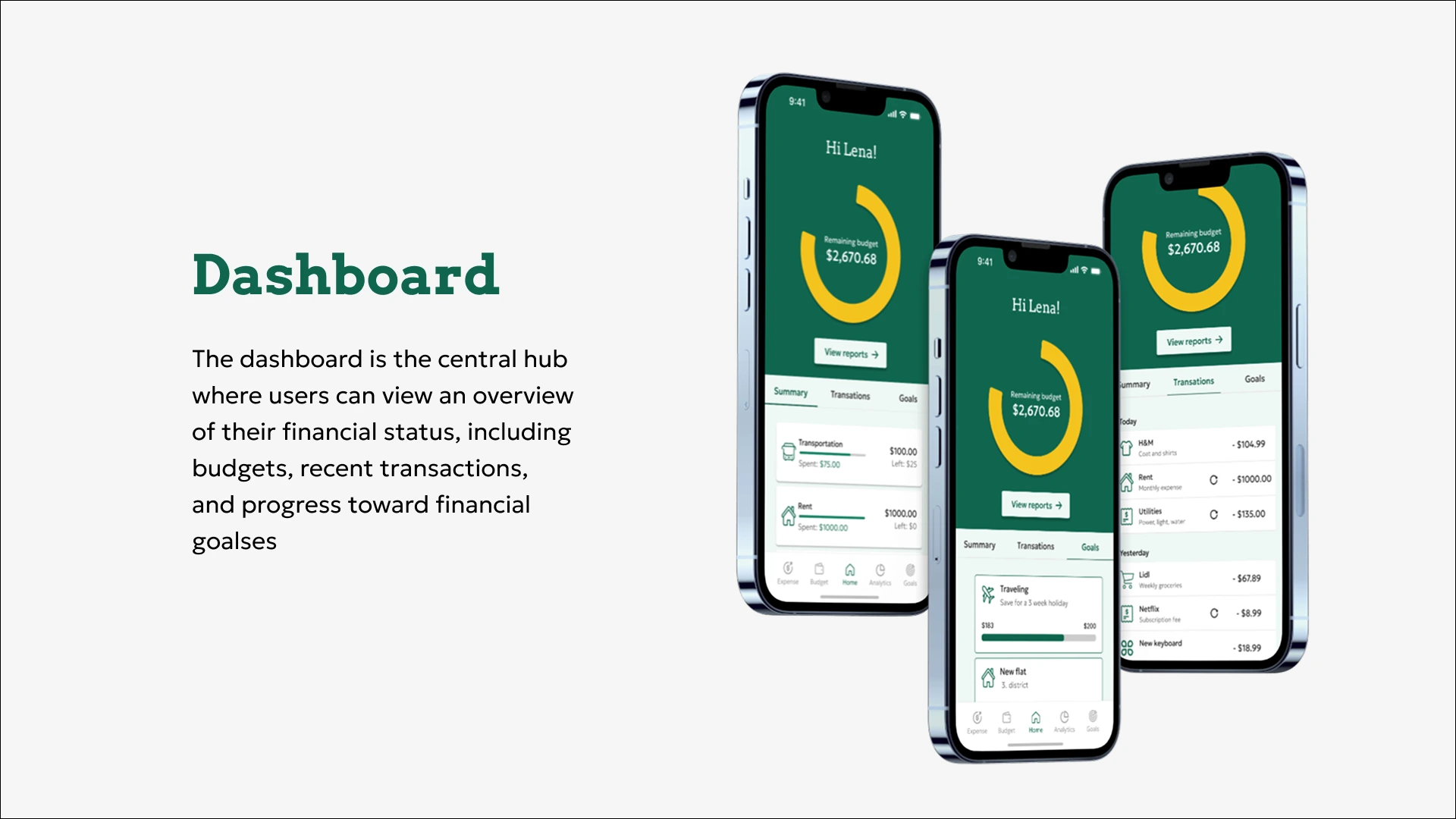
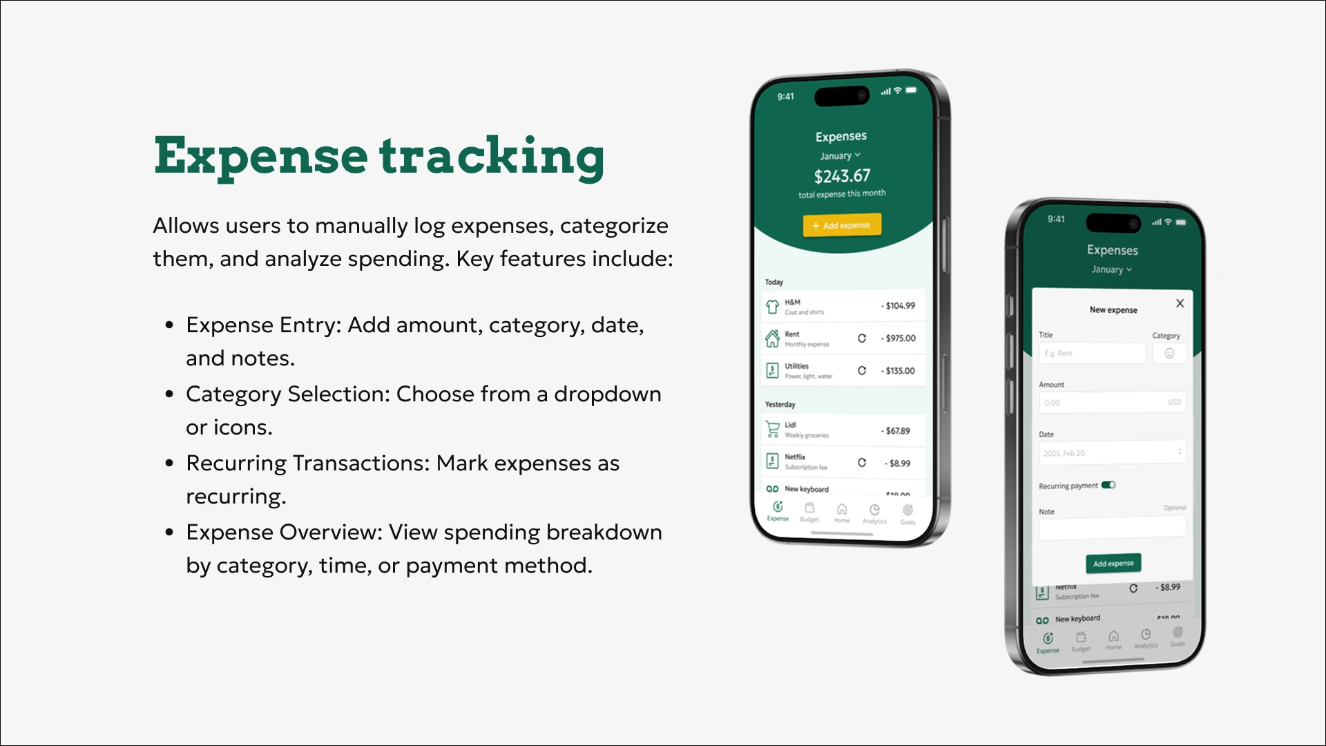
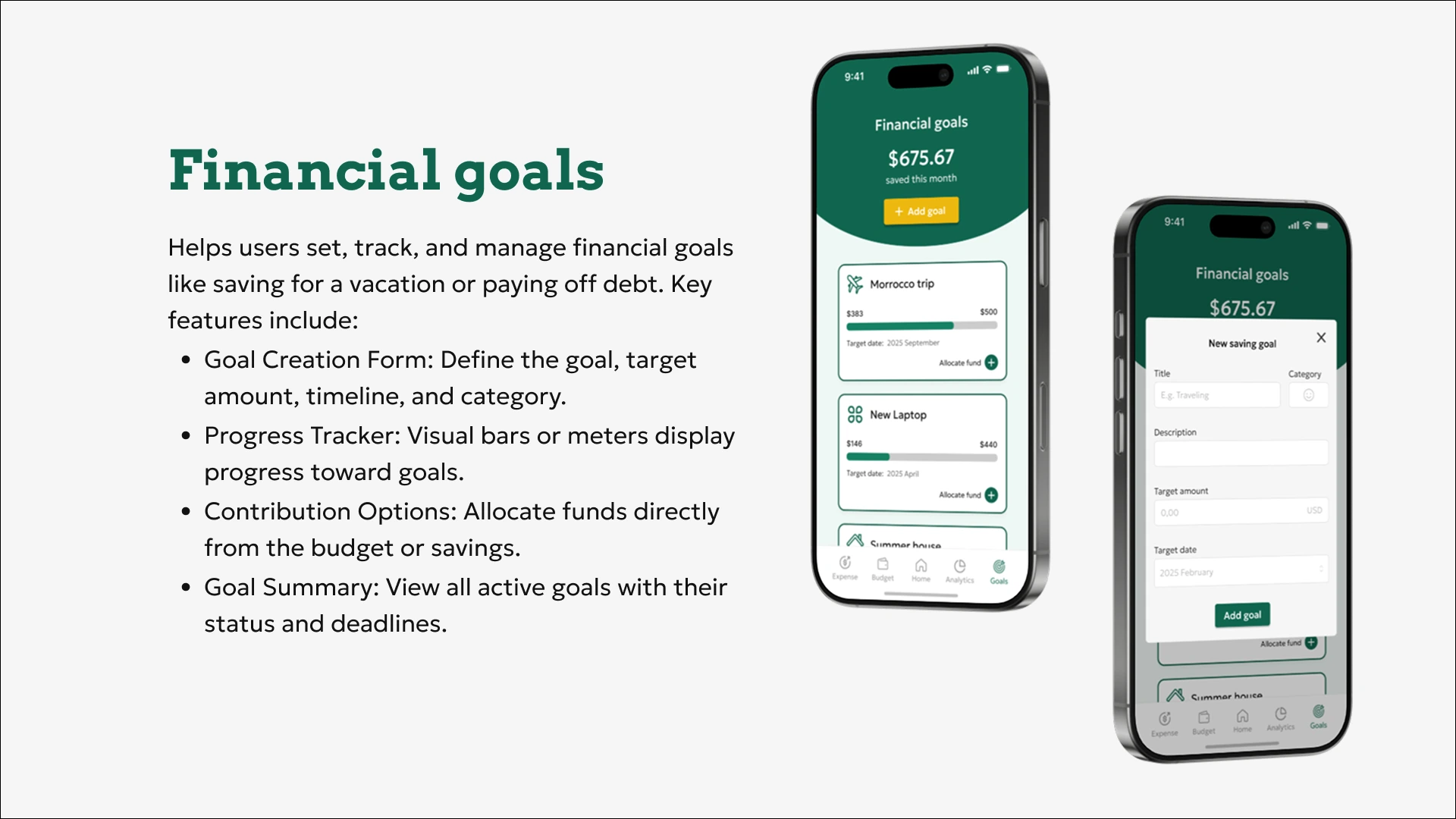
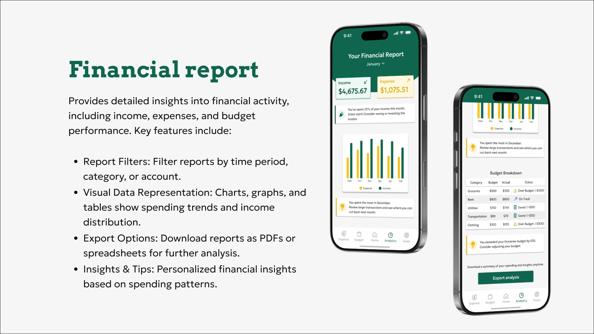
The presentation created for the final submission of the project included mockups of the app's key screens.
Learnings
Importance of Wireframing
Building the wireframe early on is essential to define the structure and guide the final prototype.
Font Pairing
Combining different fonts can create a balanced and engaging visual hierarchy.
Color Usage
I learned that yellow is a bold color choice because its contrast ratio can be challenging to balance with other colors, so I will use it more cautiously in future designs.